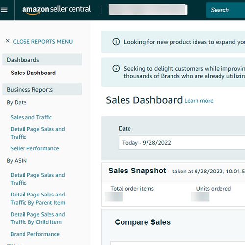
With people being used to how the Seller Central navigation was for a while – a simple, neat, easy-to-understand interface with all your options available to view right as you open it, the new navigation might be a shocker. Now, instead of a clear view of all your options right away, you have to first click on the icon in the top left corner before you’ll see your menu items.
Amazon has been testing out a new Seller Central interface for a while now, during that time Sellers had the option of keeping the old trusted navigation system. However that will soon no longer be the case – starting October 3, 2022, the new navigation will be the only one available for use. No reverting back and no option to stick with the navigation that we’ve all grown so accustomed to. Goodbye, old Seller Central, you were so good to us and we’re gonna miss you deeply!
But there’s some good news as well – it seems like enough people complained about this new interface for them to add a feature that will make it more convenient for your use! They added a bookmark bar to the new design, and you can manually add menu items that you wish to have quicker access to.
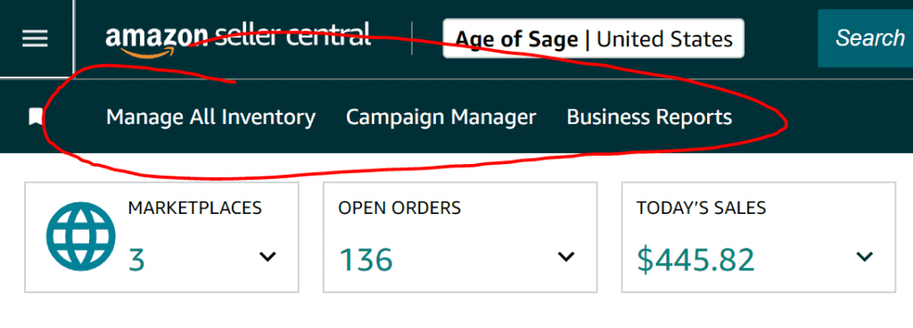
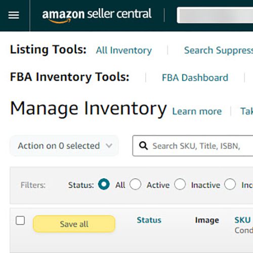
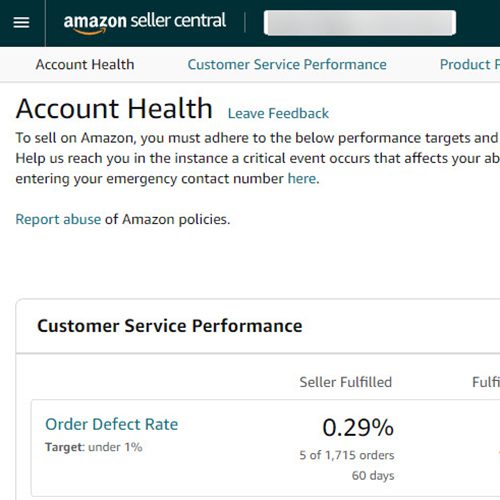
- Log into Seller Central
- Click the icon with three lines in the top left corner.
- Find the menu items that you want to have easier, faster access to.
- Find the bookmark icon next to those items and click it.
Although the old Seller Central design served us well, now that it’s being discontinued and we no longer have a choice, we’re all gonna have to get used to the new navigation. Better start now and add those bookmarks to make your job easier(and to keep your sanity, save yourself a headache!).
Final thoughts
Changes might be hard, but we hope that this information will make the transition easier for you. We’ll keep you updated on any changes or ways to make the new interface use more efficient.
Let’s hope that any further changes will be only for the better!
Have any further questions regarding the new interface or how to up your Amazon game? Contact us today at https://myamazonguy.com/contact


